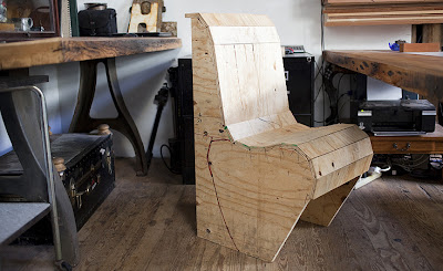
This popped up on ApartmentTherapy this morning and I like it. (Link to the article is below). I then went and searched for more pics of these guys' work and studio and I added those below as well.
It is sad that the first thing that came to mind when I saw this post was to kick myself for not buying a set of heavy iron table legs like the ones in the first pic (though not as ornate) when I saw them at the flea market two years ago. It was the end of the day and the guy didn't want to pack them up and take them home because they weighed a ton and he offered them to me cheap - but I was on my bike and didn't want to deal with it. I've been kicking myself ever since -- thinking that they would have been great for a big slab wood table, and here they are and so they are!! Well fuck me.
It is sad that the first thing that came to mind when I saw this post was to kick myself for not buying a set of heavy iron table legs like the ones in the first pic (though not as ornate) when I saw them at the flea market two years ago. It was the end of the day and the guy didn't want to pack them up and take them home because they weighed a ton and he offered them to me cheap - but I was on my bike and didn't want to deal with it. I've been kicking myself ever since -- thinking that they would have been great for a big slab wood table, and here they are and so they are!! Well fuck me.

Oh, and how about the big, boxy, white-washed light-fixture over the table? we're going to need something big over the dining table - it's dark on that side of the room.
In the below picture I really like the vertical paneling on the sides of the bar - like what we talked about except they use white-washed and natural wood slats. I also particularly like the use of old multi-pane windows as a space divider. We might consider this on the bedroom walls around the staircase so that we can close off the bedroom but still get light from the big picture window off the staircase. What do you think?
These rough-hewn boards flanking the corridor are cool and I like the use of the hinges, but it feels a little design-ey since they are purely decorative. If they actually swung closed to shut the corridor, that would be cool, but clearly they don't since the hinges are in the wrong place.
LINK: hOmE Studio of Oliver & Evan Haslegrave
And here are some more pics of their place from other sources:'
OH SHIT!!! They do open!!! Amazing!!! (following pix from an article in TheScoutMag.com) - and apparently all the pix from Apt. Therapy also originated with the piece in The Scout.
Following pix are from NY Magazine - I think, unless they took them from The Scout as well.
Let me be clear right now - I HATE how blogger.com's formatting tools jump around and screw everything up. This interface SUCKS!!!


No comments:
Post a Comment