Wednesday, December 4, 2019

Rugs: Inspiration

Rugs:This is me trying to convince you of my aesthetic of a traditional-STYLE rug but not ugly red. I am picky about the color. Super authentic rusty red is a bummer to me. Faded or faux-faded to the point of acting like a neutral and not being about the pattern: super classy and traditional but in like an effortless way that can get a little scruffy. Like me!

I'm putting the following several pics in to show what this kind of rug looks like in a room. My favorite place for this kind of rug is Lulu & Georgia. There are also actual vintage rugs we could find. This kind tends not to be as thick so maybe it's a dining area rug. They read as light but they are so mottled that I think they are a good bet for under the eating area.  Some of the following would be too light but just to give you an idea. There are lots of poly ones in this style too if we wanted to do that.

Just posting inspo now to get you in the mood. Will post actual rugs for the purchase later because that shit takes foevah.


Like they may not be your favorite rug to look at as a square on a wall, which is how we shop for them online, but in a room when they are the right amount of faded, I just think they look so classy and quiet when everything else is solid and clean.

Parlor Floor Redo: Overview and Inspo

Here is what I am thinking about for Parlor Floor Redo.
My goals are:

Goal #1: Make the space more visually calming. To me this means:

 a. Less fabric on sofa (no slipcover, fewer to zero pillows).
 b. Calmer palette for rugs and sofa. Mix cool and warm hues (now mostly warm).
 c. Softer lighting - overheads that are more visually integrated, as well as lamps at different levels. Maybe a standing lamp behind couch and table lamps on entrytable and eames unit. (The Scandis do this to create hygge - lots of light sources not just overhead)
d. Non-disgusting new blinds. Should be easy.
e. Solid baskets to replace the wire ones so that we can't see all our mittens all the time. Nobody needs that.
f. Toy storage solution. Part 1 was moving most toys to extension closet to create toy rotation program, but now where to keep things that are out at a given time.


Goal #2: Spend more time at far end of room. Alone or with COMPANY! To me this means:

 a. Better couch. This one is comfy but I hate the slipcover so much. Also dislike high tuxedo arms - it means you can't sit with a book and put a table next to it for beverage/book/phone whatever - you are always reaching over in a weird way. I feel isolated in a little box when the arms are so high. Also maybe sofa should be less long (aka shorter) so sitting in an L shape doesn't feel so crazy.
b. Abovementioned sidetable of some kind to facilitate reading on the sofa. Or sitting with drinks with friends. Imagine!
c. Either no chair or chair that is not terrifyingly white and expensive. Either smaller footprint side chair or big comfy cushy for the kids to jump on within reason and without fear. Prefer former.
d. Again, softer and more appropriately sized rug at that end so kids actually hang out there.
e. Must do something about hole in window. It is drafty and embarrassing.
f. Radiator cover would be nice to make that area feel like part of the room and not like "oh yeah that's where the mouse village is". Plus you could put some kind of houseplant there? Am I crazy? Am I *reaching* for the stars here? (I mean in dreamland there would be built-ins over there but I'm assuming that's for later reno)

As I see it, the critical elements to purchase are:

1. Rugs.
2 9x12s. One foodsafe-ish and one cozy, that go together within reason.
Estimate: $1200-$2600

2. Sofa.
I am pretty much just looking at Article because they are attractive and reasonably priced and everyone likes them. Low arms, the right length, comfy and durable. And, ahem, not fucking white. (Secondarily but not high priority: different sidechair)
Estimate: $1200-1800

3. New blinds.
I'm fine with similar to current style but we must fix the cord situation, it's horrible. Also open to just plain curtains on a nice brass rod of some kind. Question: we have all those extra shutters in basement, are we able to use them?
Estimate: no idea. Gotta talk to blinds place. Find out about shutters.

4. 2 new light fixtures for overhead.
(Secondarily: one reading lamp for next to couch, one table lamp for entry table and one for eames unit)
Estimate for 2: $600-1200

5. Radiator cover.
Probably made to order. Should get one for kitchen too.
Estimate: Dunno. $300 each? No idea.

(Bonus: 6. Mantel. I dream of a mantel. Just to differentiate the space, put pictures and xmas stockings on, and because they are pretty. Sigh.)

Total:
$3300 - $5600 not including blinds.

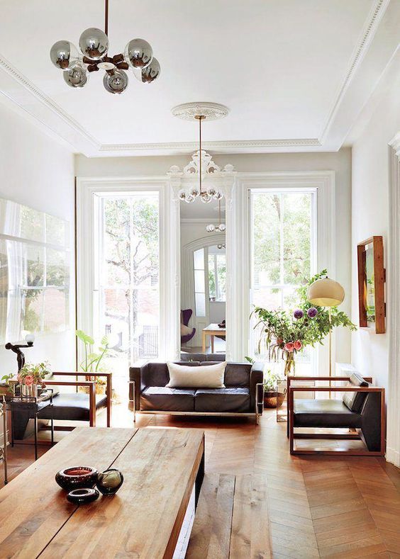
I am now going to post some inspiration pics as an illustration of the general VIBE. I think sometimes you think about particular elements you like and don't like without imagining it within the whole picture. Please notice what these have in common even if we don't love every single piece on its own. Dig, if you will, this picture:


What I like:
Neutral palette (the bare floors help). Globe chandeliers that go together but aren't identical. Mirror between windows. Wood/leather combo. Not huge couch means the whole sitting area feels included. Plants. Daylight visible through side chair.


What I like:
Neutral palette. curtains on a rod are handsome, simple, and give the space levels. Style of light fixture is cool and dynamic. Leather/wood/fabric mix. Plants.


What I like:
Neutral palette (noticing a trend?) Plants (ditto), leather/fabric/wood combo. Globe light. These are both Article sofas that I think are perfectly cute and kid friendly. Mid-century without being rat-packy. Although she has a different rug now.

Notice another thing these have in common: some black or dark grey elements mixed with the light and wood tones. I respond to it naturally but now I'm noticing it is grounding and grownup and gives texture to have all those lighter tones in there. I love the cleanness of the Scanifornian vibe that is so trendy but the black touches makes it a little more approachable and New Yorky. Like me!


Monday, November 18, 2019

Entry Vestibule Storage Solutions

Hello Dear!
Our topic for today is limited to cubby/coatrack style entry-way storage solutions for childrens' coats, backpacks, bike helmets, galoshes and so on.

ECR4Kids seems to manufacture the most reasonably priced, durable solutions so I'm sticking to their offerings.

OPTION A - "Double-Up"
2 units wide. 48" tall.  With toe-kick and bench.  We would need 2 of these side by side.  By doing so, we would come closest to achieving all of our goals - except it might look funny to have two side by side with the double panel in the middle where they are joined.
$158.88 each.
https://www.amazon.com/ECR4Kids-School-Toddlers-2-Section-Natural/dp/B0085YVVBK/ref=pd_bxgy_328_img_2/132-4223901-1249946?_encoding=UTF8&pd_rd_i=B0085YVVBK&pd_rd_r=8d88429f-8dbf-414e-8a94-e3c9a4225cb0&pd_rd_w=mLeOX&pd_rd_wg=YlUHk&pf_rd_p=09627863-9889-4290-b90a-5e9f86682449&pf_rd_r=KD4Q53RMTEWXZSZ1GZX6&refRID=KD4Q53RMTEWXZSZ1GZX6&th=1

OPTION B - "Almost Perfect"

4 Units wide.  46" tall.  No toe-kick.  No bench.  But perfect width and height.  We would need to attach some small legs to it to elevate it off the floor.
$199.99
https://www.amazon.com/ECR4Kids-Streamline-Classroom-Hardwood-4-Section/dp/B07QG91PXV/ref=sr_1_fkmr0_1?keywords=ECR4Kids+Birch+Streamline+Classroom+Locker+4&qid=1574093418&s=industrial&sr=8-1-fkmr0


OPTION C - "Shorty"
4 units wide with bench.  Perfect width but only 35" tall because it doesn't have the bottom row of cubbies for galoshes.  This one is intended for toddlers.  Also, it doesn't have a toe-kick which means it might not level as easily.
$203.13
I almost love it, but we would need to elevate it and we still get less storage because it doesn't have the top row of cubbies.
https://www.amazon.com/ECR4Kids-Streamline-4-Section-Backpack-Toddlers/dp/B075YXSCVQ/ref=sr_1_2?keywords=ecr4kids+4+section+coat&qid=1574093014&s=industrial&sr=1-2-catcorr

OPTION D - "the Big'un"
5 Units wide - it fits but would be about 4 inches forward of the wall because of a pipe.


Sunday, August 26, 2018

Fwd: Ixtapa: First Dip!


---------- Forwarded message ---------
From: Jonathan Hendin <jdhendin@gmail.com>
Date: Sun, Aug 26, 2018, 5:46 AM
Subject: Ixtapa: First Dip!
To: Smaller Blog <egonblue1.smaller@blogger.com>


Such a long day. These kids are troopers. All they wanted to do when were got here (after 12 hours traveling) was go in the pool - so we did. And they were nutsy all over the place. 
These good kids are good at being kids. It's a shame being a grown up doesn't come as naturally. 

Test

Test

Friday, April 27, 2018

Living-Dining Room Hybrid Layout Ideas

#1 - Similar shape and layout LR but narrower and doors are open so no need to leave room for entry door in-swing.  I don't like the table placement, but I really really like the open door to the entry area.  Worth thinking about.  Also, painting over painting between the windows is really nice and feels less... precious? less emphasis on pride of place?

#2 - Note how important the dedicated light fixture over the dining table is to creating feel of a separate space.  We can do that.  TBD.

#3 - Totally diff shaped room, but interesting to see the table in front of the fireplace.  And, while we're at it, is that a Nicola Tyson over the mantle?  (I don't think so, but it has the same strong brushstrokes in primaries/secondaries on a neutral background.  I like it.)

#4 - Including this one to show how to manage a long LR with separate uses at either end.  Again, the off center light fixture  over the table makes a big diff to defining the space - worth considering moving ours over 12 inches.  It is narrower than our space so built-ins on the near-wall side of the dining table wouldn't cramp the dining area any more than this one is already. Also, love love love the dining chairs - Wegner rope seats I think with a sexy, curvaceous back rest.

#5 - This is an upper floor so it has the extra room to the side, but still - the credenza/buffet is nice to see.

#6 - Just one question:  Where the F do these people keep all their pots and pans and stuff?  Or do they just not have much stuff?

#7 - Out of reach.  I like that there is a whole other dining area on the porch mirroring the indoor one.

#8 - Pretty good.  The off-center rug defines the dining space.  We should do that.  This setup makes me wonder if we should have gotten a bigger dining table - we can't fit 10 people at ours!

#9 - This is it! This is the one. This could be our thing. I love this! I love both ends of this living-dining room.  How do we feel about built-in base cabinets with no shelves above?  I like the look and it doesn't make it feel crowded.  And at the other end, the full built-ins are nice - as are the drapes, and the light fixture and the lounge chairs - yes the lounge chairs - oh, the lounge chairs!
#10 - A lot of good things going on here.  Mirror between windows.  Broad plank table.  Nice seating area arrangement. Cool lounge chairs.  Beautiful wood frame on the right side.  

#11 - Just admiring the view through the three spaces: kitchen, dining room, living room.  Oh, and we should hang a boat from our kitchen ceiling.

#12 - Again, the view through the three spaces: kitchen, dining room, living room.   I like this one more.  Buffet on the right.  Art over it.  Separate lighting schemes for the separate ends of the room.  A console separates LR from DR.

#13 - Nice table.  Nice benches.  Not our layout, but worth a think.

Built-Ins Beside a Fireplace - Preliminary Thoughts

Here we go:

#1 - Lovely, but a little deep and not sure it would work if we only do one side of the chimney breast.  Also, there is no chimney breast here so it isn't our set-up.

#2 - Again, very nice.  I like this more - not as deep - indeed, sort of flush with the front of the chimney breast.

#3 - I love this - I thought I wanted the bookshelves to be shallower than the base cabinets, but this makes me reconsider.  Note however that these shelves are full width - not cobbled together bookcases - and the base cabinets are reeaaaaalllly wide.

#4 - I like the built-ins, but I don't like that they extend beyond the mantle.

#5 - Fantastic layout - and the only thing I've found that has a dining table in front of the built-ins.  So, bravo!  I'm not minding even that the base cabinets are flush with the bookcases.  But the style is a little rustic, beach-housey for me.

#6 - Again, I don't love the base cabinets proud of the mantle.

#7 - YASSSSSS!!! SLAY! I'm ready to have these installed immediately (at Ikea prices of course).  And I love the fireplace surround - marble rocks.

#8 - Shy, proud, shy, proud, shy, proud, shy...  Yuck!!!  And I didn't expect to so thoroughly dislike the way the fireplace surround/mantle is integrated (at least sylistically) with the built-ins.  YUCKO!!
#9 - I like this a lot.  Note that the base cabs and the shelves are flush - not a problem.  I even like the modern mantle treatment.  Right on.  And that boat on the right side is super-cool.

#10 - Same as #4 but with a diff perspective.  I still don't like the base cabinets so far proud of the mantle.

#11 - This one makes the point better - it just feels crowded with the base cabinets sticking out so far in front of the fireplace.  Not my thing.

#12 - I like this a lot, but not so much for us for a few reasons: (a) all custom work so $$$, (b) color is a little too much warmth for what we have going on, (c) too busy for our already busy space, and (d) no base cabinets.  But still, a lovely arrrangement.  Gimme that marble mantle!

Wednesday, May 24, 2017

New Artwork: Scale Matters

After years of looking at some big white spaces on our walls, the past two weeks have seen extraordinary progress.

Two weekends ago, I picked this painting up at an estate sale in Cobble Hill:


I love it!  I am especially excited to have found an abstract painting of this size that I like so much.  SO MUCH!

It is by a painter named Joe Clark and was included in a show of his work entitled "Ibizan Bitch" in January 1962 at Camino Gallery in NYC.  (A little history: Camino Gallery was one of a group of artist-run, cooperative galleries known as the "10th Street Galleries" located in the East Village in the 50's and early 60's.  Alice Neel and Elaine DeKooning, among many others, were members of Camino.)

Then, this past Sunday, I bought this painting from my next door neighbor at his stoop sale.  His mother painted it sometime in the 60's:


V loves this one.  She says she feels about it the way I feel about the first one.  So, that is good.

The two paintings are on opposite walls facing one another at one end of our living room.

So, what about it?  

Well, the first big takeaway here is that scale matters a lot.  For 15 years we have been hanging small pieces in these large spaces and it never looked right.  

The second takeaway is that hanging art immediately is the way to go.  We live with dozens (literally) of small pieces of artwork that are not hung - just leaning on top of things or stacked in closets.  With each of these paintings, I went straight out and bought hooks and set up my laser level on a tripod and hung them right away.  

Finally, I am inspired to hang more of the art we like which is lying about as soon as possible.  I don't really need to worry about putting holes in the walls that I might regret since the walls I'll be hanging them on are so beat up anyway that it can only be an improvement.  Time to get on that.

Thursday, March 16, 2017

Desk for Sadie

A couple options. One from ikea. One from overstock.