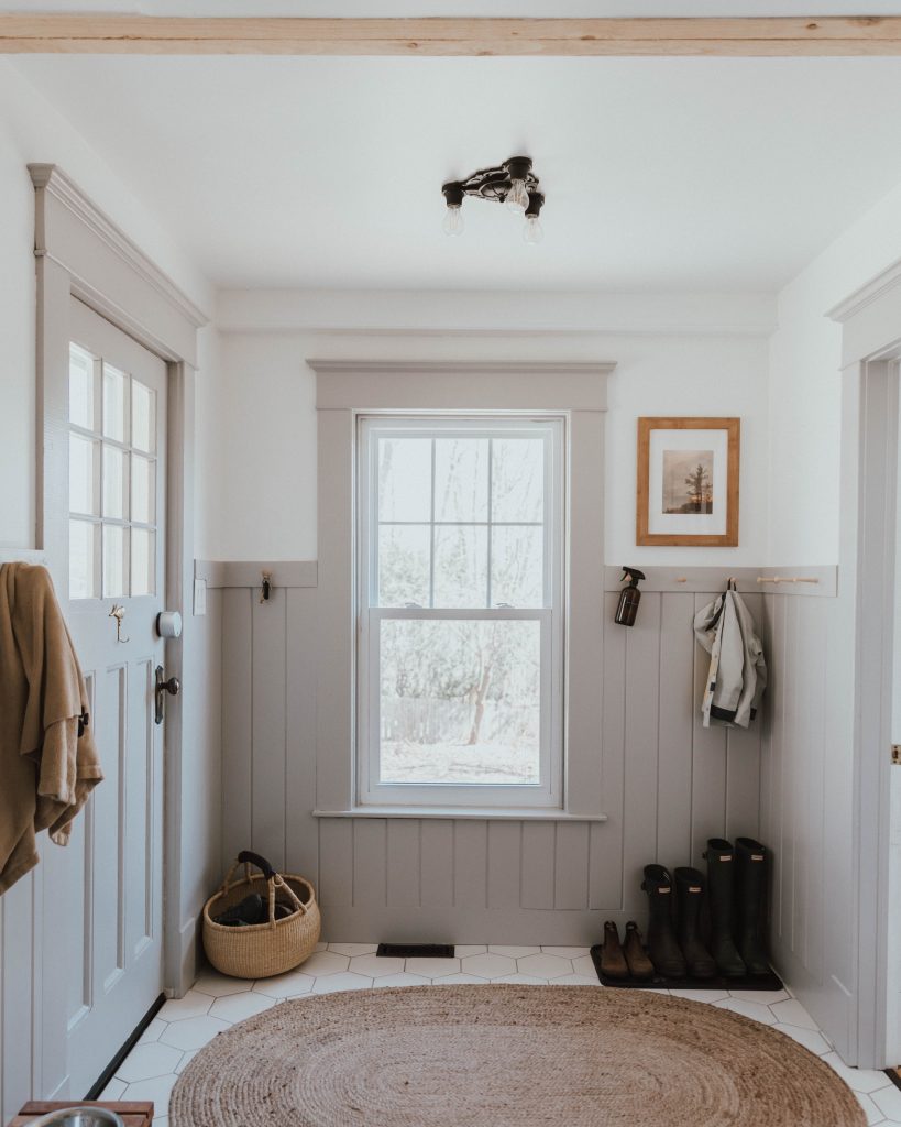
I think it's time to start making sure we are somewhere in the same universe of looks we are going for. I recently came across this post from a designer I follow who was trying to describe this look as "Modern Traditional". Runners-up for names included "Updated Shaker" and "Millenial Primitive" lol.
Scandinavian inspired, a bit farmy, calm and cozy and practical without being too Modern Farmhouse (see end of post).
FEATURES INCLUDE:
-adding interest with TEXTURE more than COLOR: wood, metal, tile, natural materials.
-Handmade/vintage feel. WORN WOOD pieces, comfortable things to sit on
-Non-showy details. Simple shiplap, CRAFTSMAN DETAILS
-Layered NEUTRAL COLORS (works subconsciously to create a calm, sophisticated mood)
-Subtle BITS OF INDUSTRIAL like lighting, hardware, but nothing too clunky or steampunk or "period"
This might seem really boring to you but the FEELINGS I am looking for are:
-CALM, soothing, cozy
-high-quality, pleasant to the touch, but have some personality/age and can stand some wear. IF A BEAUTIFUL LL BEAN WOOL SWEATER WERE A HOUSE.
Here are some photos where we are not necessarily doing any of the particular elements but create the vibe I am looking for:

I like:
-tonal whites - note the cool white on walls, putty white on cabinets
-raw wood combined with black/white wood
-the light fixture is simple and timeless without being too heavy
-dining table is super practical
-texture of the boards on ceiling

I like:
-All the wood furniture, but not the same wood. The midcentury credenza and chair on the side feel of a piece with the simplicity, not spaceagey. Note the beatup dining table with painted chairs again
-Colors are neutral but who knows what color this wall is. Like you'd walk in and think, this is a white room, but it's probably purply gray or something. I'm not saying I want this color, just that thing of a non-white neutral with depth that looks good even in a dark corner
-Light fixtures: again, a bit industrial but not like a giant hulking metal object over your head


This is probably the best example because it has a timeless vibe without anything being too styled in a twee, old time-y way (like some below, I admit). I love:
-Beat up farmhouse dining table
-neutral palette that reads white but might be darker (balances cool and warm tones)
-stone floor
-wood beams against clean everything else
-love the shiplap on the island and the bits of wood trim
-industrial but not overpowering lighting

I love this green, I know you'll hate it.
-color palette
-half wall with plain shiplap and different color on bottom

Another half wall. Seriously considering something like this for dining room
-I LOVE Shaker pegs. I think we should have some right behind the door between door and dining room window. I think you will hate that idea too.
-love this weird color on the bottom half of wall.

Same idea but simple board and batten detail instead of shiplap.

Trying to find examples of Shakery wood against more modern stuff

Not sure if this is quite it (it's so clean) but I'm including it to show how midcentury and shaker can live in harmony when they both veer toward simple, Scandi vibes.

A bit twee, but note:
-Beat up table
-Tonal whites
-Timeless-ish lighting
-Mixed vintagey wood

-Palette (only the ceiling and sink are actually white but it reads as a bright kitchen)
-modern light fixtures balance classic everything else
-texture from tile

-lights
-dining table
-boards on walls
-flea market art

Again, a bit of pilgrim cosplay with the styling, but just an example of how cool a judicious bit of black can look against white and wood.
Having a harder time finding examples from living and bedrooms, but this gets us started.
I think if we start here then we have room to do special little "moments" as the bloggers say, with a piece of art or tile or chair or lighting here and there. I just don't want any one area to feel too contemporary or midcentury or colorful or loud.
POST SCRIPT:
Perhaps it would be instructive to put what I am afraid of (what I DON'T want).
A: What I'm afraid Jonathan will want:

This is obviously an exaggeration, but the idea:
-lots of color
-midcentury that looks Mad Men, not scandinavian
-loud art
-out-of-place lighting
B: Don't call it "Modern Farmhouse"
Modern Traditional is NOT Modern Farmhouse (though I am sure there is overlap). The latter is super suburbanized with lots of fake handmade elements and too-bulky industrial lighting. Barf. Magnolia founder Joanna Gaines is the Empress of this look. It is to actual Rustic what Lady Antebellum is to actual country music. Which means I'm going for like, Joni Mitchell.

3 comments:
Nice articles and your information valuable and good articles thank for the sharing information Luxury plastic chair
Nice articles and your information valuable and good articles thanks for the sharing information commercial café plastic chair designs
Nice articles and your information valuable and good articles thanks for the sharing information lightweight cafe chairs
Post a Comment